Best practices: How to write company brand guidelines – Typography
In this series of Best practices: How to write company brand guidelines, deBroome will be sharing our expert knowledge of style guidelines – how to get started, what to include and questions to consider. We hope to give you the tools to create a solid foundation for your brand style guidelines.
Chapter 2: Typography
The art of typography plays a major role in a company’s identity. Through alphabetical letters, a company’s personality and values are conveyed. For these reasons, a company may choose to create their own typeface. In opposition, a company may use a recognizable typeface that they believe carries established perceptions which they want to portray. Either way, a company’s typeface is used for documentation and promotional purposes and in some cases, applied to a company’s logo.
Types of font
As noted, typography shapes a company’s personality. Therefore, it is vital to consider what typeface will be at the forefront of forming this image – primary font. To add variation, a company may have a secondary typeface which is limited for distinct purposes or recipients.
- Primary: the most recognizable and frequently used font
- Secondary: a supplementary font to the primary font
- Web safe default: a backup font that displays when a digital device doesn’t support the specified font. This is because the font is not installed on the device or originates from an unfriendly source. The most common fonts include Arial, Verdana, Helvetica, Courier, and Times New Roman.
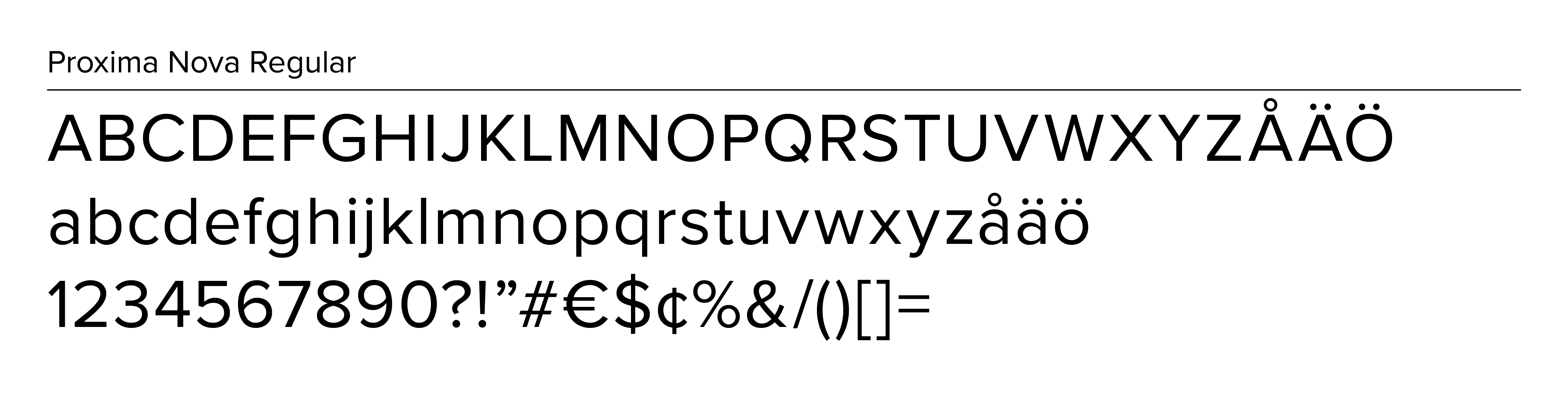
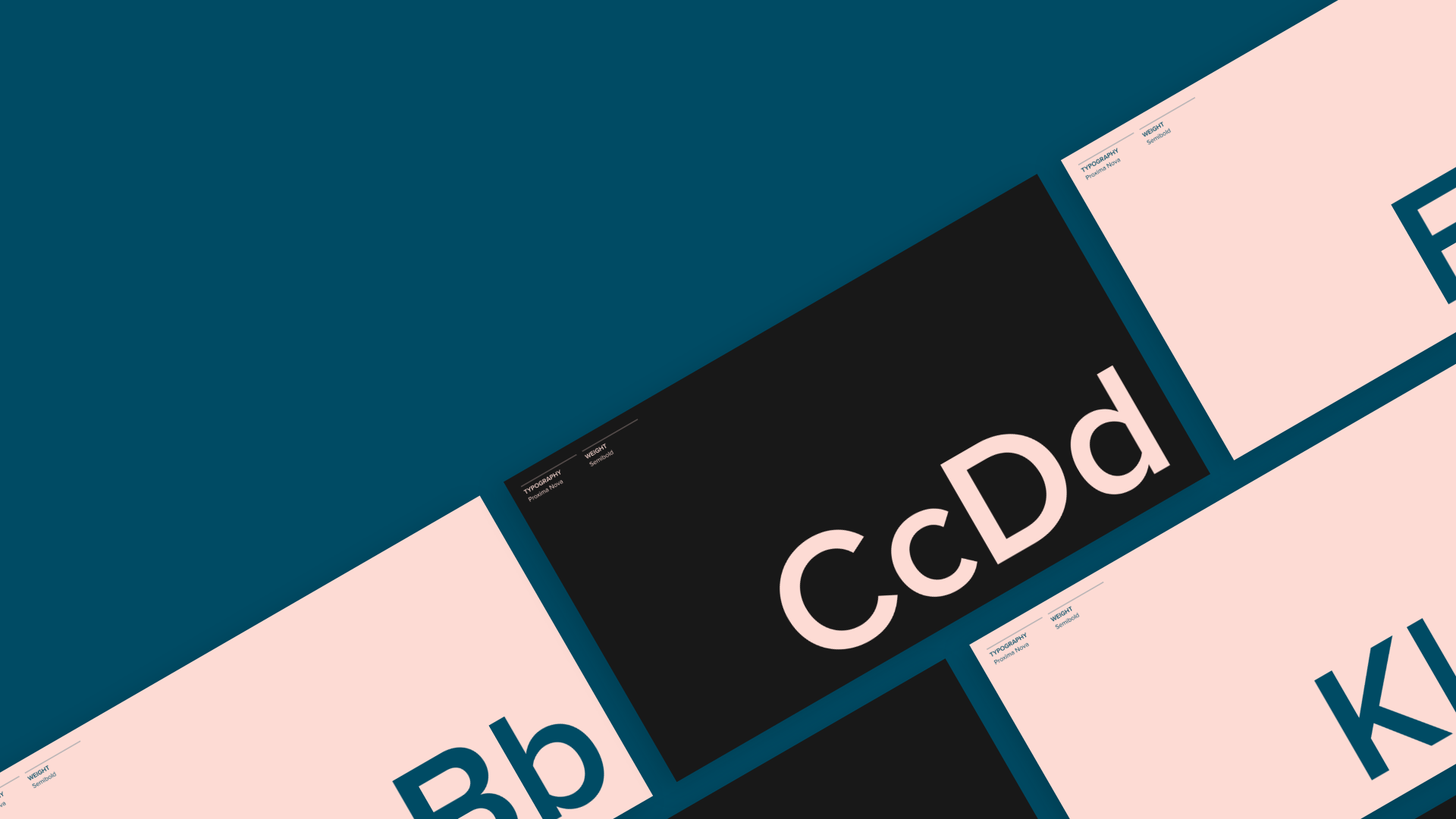
deBroome's primary font: Proxima Nova Regular
Size
Font sizes should be specified for both print and digital use. There are four different size formats: points (pt), pixels (px), percent (%) and ems (em). Usually, a company does not have guidelines for font sizes in each format. In contrast, they choose a format that best suits their needs.
For print use, measurements are given in point size (pt). Points are fixed units and not scalable in size.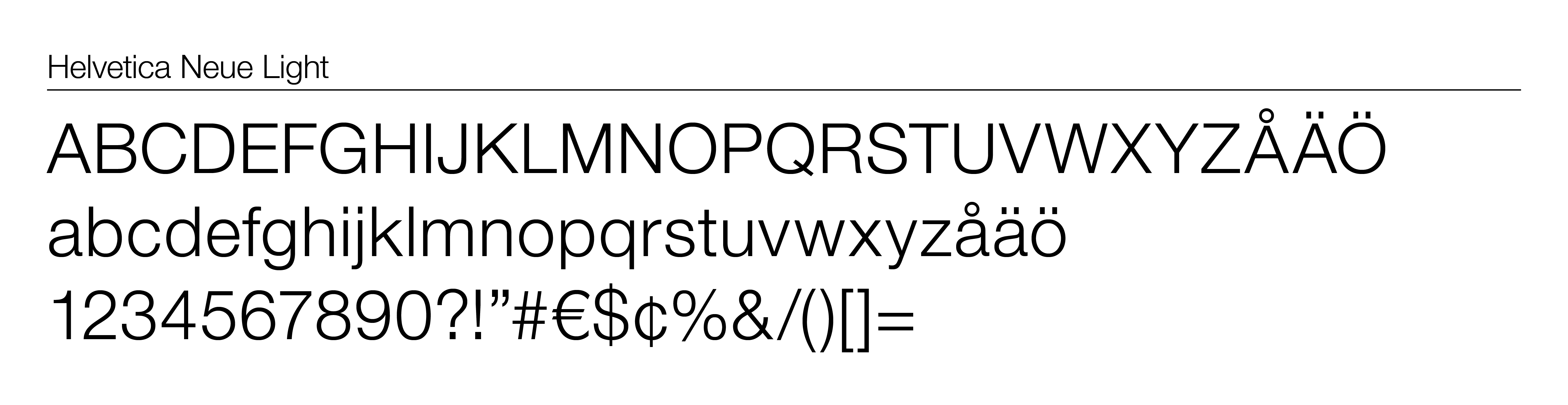
deBroome's print font: Helvetica Neue Light
Digital
Digital measurements can be in pixels, percent and ems.
- Pixel (px): one pixel equals one dot on the digital device’s screen
- Percent (%): based on the default size and scalable through percentage
- Ems (em): referenced from a document’s default size and scalable by multiplying the original size
Pixel
Popular among digital designers, pixel sizes vary depending on the device’s screen. Therefore, it is difficult to define pixel sizes according to all devices. In return, pixel sizes are not scalable for mobile devices or visually-impaired readers.
Percent
Percent distinguishes one size and then scales variations based on the chosen size. In other words, a particular font size is selected and different sizes are derived from the default size. As a result, the different sizes are communicated in percentage.
Therefore, 100% is the original size. If a size is 110%, than it is 10% larger than the default size. Percent is fully scalable on mobile devices.
Ems
Similarly, ems work in the same matter as percent. However, instead of scaling by percentage, a default em is chosen which is represented as 1 em. Then variations of the size are scalable by multiplying or dividing the original size. For example, if 1 em is equal to 12 pt. then 2 em is 24 pt. and .5 em is 6 pt..
Ems have a scalable ability for different devices.
Weight
The weight of the fonts informs how thick the letters are. The weight can be defined as regular, light, medium, bold or italic as well as a personalized classification. The weight is represented in numeric terms on a scale from 1 to 1000. A high number indicates a thick font. For print, the weight is not specified in numeric terms but only as it’s named.
CSS3 module written by C3C describes the standard names and sizes for the font’s weight:
- Thin: 100
- Extra Light/ Ultra Light: 200
- Light: 300
- Normal/ Regular: 400
- Medium: 500
- Semi Bold/ Demi Bold: 600
- Bold: 700
- Extra Bold/ Ultra Bold: 800
- Black/ Heavy: 900
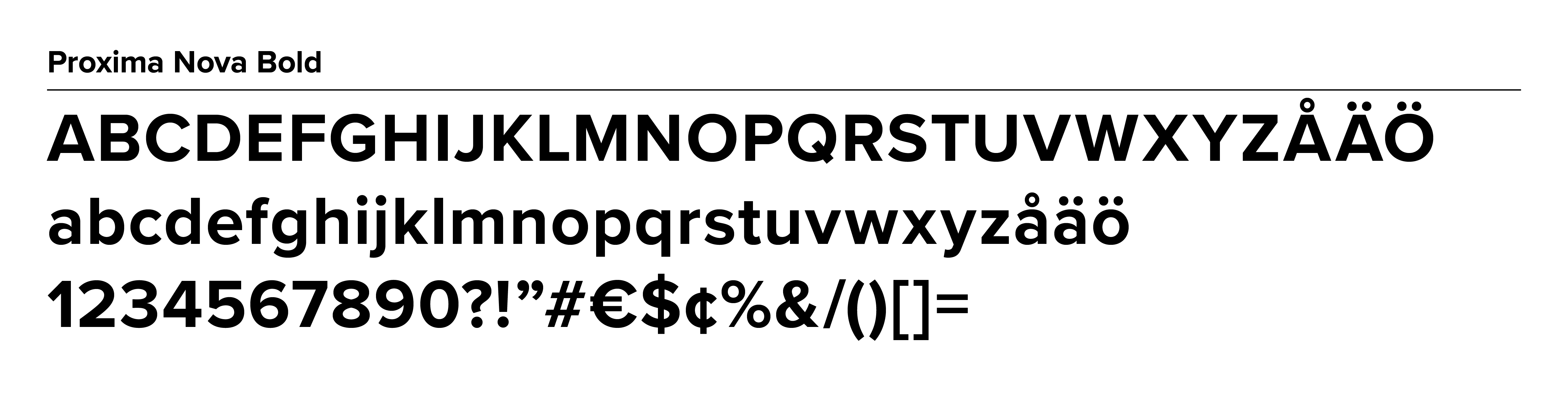
deBroome's primary font with a weight of 700 px (Compare above: Regular, 400 px)
Color
A pop of color can be added to all fonts or some headers for the use of drawing attention to important messages. Companies should stay true to its color scheme as this plays a role in their brand consistency and what affects it has on the consumer.
It is important to note how color should be used against certain backgrounds or images. Colored fonts should always be legible.
Colors can be shown through shadowing, textures, shading, multi-color or transparency. In some cases, colored fonts are referred as chromatic fonts which are multi-dimensional or consists of several tones. Within the brand guidelines, it should specify what coloring techniques are permitted and prohibited to ensure it is aligned with the brand’s identity.
Hierarchy
Standard specifications, like style, size, weight and color, are outlined for print and digital use. This includes forms of advertisement, office documents, contracts/policies, presentations and templates. Digitally, this incorporates emails, articles, header styles, body text, tabs, buttons and menu.
Variations
Variations are specified from Header 1 (H1) to as many headers a company needs (H2-H6). H1 is the largest and the following headers decrease in size. Paragraph (p) is referred as the body text. The purposes for the variations should be clearly explained.
As noted, the variations should be stated in the font style, size and weight as well as color if applicable. Instead of indicating a specific size (e.g. H1= 60 px, 4 em and 240%), the variations of size can be addressed in relations to other sections of copy. For example, you may specify that the body font (p) should be the point of reference and a sub-header (H3) is twice the size of the body text. Therefore, specific sizes do not need to be stated but only the proportions.
Exceptions
A company may want to note exceptions to the other rules. Frequently, the use of italics is considered an exception to the rule as it has the ability to make text stand out against the surrounding copy.
Grid
A grid maps out spacing between elements. It gives clarity to the use of whitespace, alignment and overall structure of the text.
Treatment
General rules about the treatment of fonts consist of alignment, horizontal spacing, leading and capitalization. The rule’s purpose should be explained to help the reader utilize the rules with confidence.
Treatment includes but is not limited to:
- Alignment: how fonts should be aligned – left, center or right alignment
- Horizontal spacing: length of one line of text, specified by number of characters
- Leading: distance between fonts within rows, also known as line spacing
- Capitalization: uppercase letters including ALL CAPS
Do's & Don’ts
Examples of Do's & Don’ts give a clear understanding of what is allowed and not permitted. The most common examples consist of use of typeface, alignment, spacing and legibility. However, keep in mind the other components mentioned in this article.
Example of spacing characters
Sharing fonts
Corporations need to be careful about sharing font as it may be licensed. In this case, it is critical to know the terms of the font license to avoid any legal issues.
When purchasing font from a font supplier, they may recognize freelancers, advertising agencies, and other company suppliers as independent entities which require their own license. Therefore, the company will need to purchase additional licenses for partners.
If a company hires a design agency or type designer to create a personalized font, then more than likely the company will buy the distribution rights from the creator. Thus, the company can share the font how they see fit.
Previous chapters
- Chapter 1: Logotypes
Stay tuned for upcoming chapters:
- Chapter 3: Colors
- Chapter 4: Imagery
- Chapter 5: Complementary design element
- Chapter 6: Pictograms
- Chapter 7: Digital Design
- Chapter 8: Print Design
- Chapter 9: Video guidelines
- Chapter 10: Interior design
- Chapter 11: Brand strategies
Follow the Best practice series and sign up for our newsletter.
Related article: Discover the secrets of typeface design with Carolina Laudon