Best practices: How to write company brand guidelines – Digital Design
In this series of Best practices: How to write company brand guidelines, deBroome will be sharing our expert knowledge of style guidelines – how to get started, what to include and questions to consider. We hope to give you the tools to create a solid foundation for your brand style guidelines.
Chapter 7: Digital Design
As we are exposed to digital communication everyday, a company’s digital presence has a central role when it comes to building the brand. Needless to say, it is essential that the digital design aligns with the overall visual expression of the brand. This chapter starts off by explaining what to consider in terms of digital design, to later go into different UI elements, and last but not least provide examples of how all elements can work together.
What to consider
Digital design can be viewed as an extension of the brand. There are various core brand elements that constitute the foundation of the brand identity, such as tonality, logotype, illustrations, imagery and typography. In the digital context you should also consider your UI elements. These can be used to strengthen the digital visual expression and should therefore support and cohere with the core brand elements. Below we present a selection of different UI elements and what to keep in mind when working with them.
UI Elements
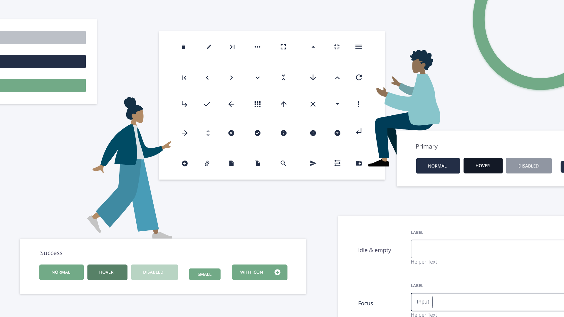
Buttons
A button guide the user how to move forward, what they can click on and what they can’t. There are many ways in which a button can alter shape and expression dependent on the intended outcome of clicking the button. Determine the purpose, is it to learn more about a subject, download a file or go to the next page?
The layout of a button can also evoke different emotions, think about what it should signal – danger, success or something else. Note that buttons have different states. Using the hover effect in the button design will demonstrate when a button is active.
There are different types of buttons:
Primary button: Most frequently used, especially good to encourage a call to action.
Secondary button: Works complementary to the primary button and preferably used when the user should learn more or go into detail.
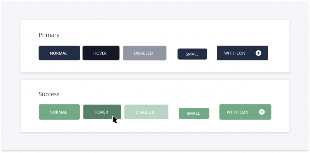
Icons
Icons can be used to explain actions or objects through symbols instead of, or together with, text. Icons are great to help user navigation. Meanwhile, they leave room for additional elements and provide a variety in the digital visual expression.
The design of icons should be simple, yet include just enough details so they are understandable. Whether users are viewing icons in different sizes or contexts they should recognize them and their meaning.
Dependent on a company’s budget, the search for the right icons can differ. A large budget comes with the opportunity to purchase icons with a design exclusively made for the brand. Alternatively, it is possible to purchase from an icon library or order icons free of charge.
Loaders
Loaders are a great way to inform the user that an action is soon completed but that it takes time. The design of loaders can vary dependent on what effort is being made. If there are several large files or images to upload, it is recommended to use skeletons. This will give an indication of where the content is going to be placed and create a perception that it takes less time, even if it doesn’t.
If the effort is to connect to a server or send a document, make sure to include an explanatory text in the loader design to keep the user informed. If it is possible to state the time remaining – even better.

Web font
Web font becomes important as it makes the content readable. The user can decide to read more or choose to leave, and the web font plays a crucial role in this decision. As we mentioned in our Best Practices series on typography, not all fonts are supported in the digital environment. Many companies may have a web safe default that can be displayed whenever the specified font is not supported.
It is also essential to consider whether or not the chosen font is responsive, this can differ between web and mobile. Ensure that the font chosen for desktop is supported on mobile devices as well.

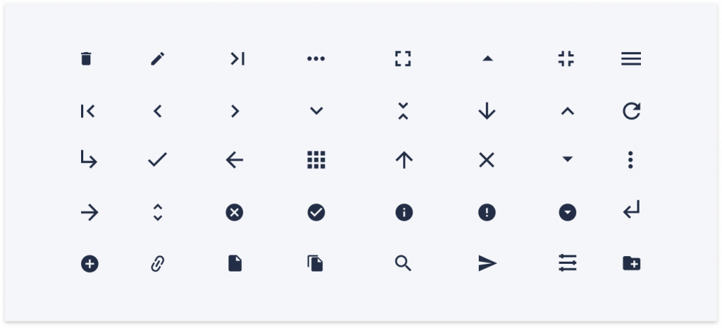
Forms
Forms are used as a terrific data collector. They require effort from the user and should therefore be easy to understand and complete. In order to achieve this, there are different features to take into account in the form design.
The order of the input fields should be logical, so that users don’t need to search where to enter the information. Also make sure to clearly display optional and mandatory fields to avoid confusion. Additionally, it is important to consider the design of error states so that it is visible when users have entered the wrong type of information or completed a form inaccurately.
Tying it all together
As mentioned in the beginning, the UI elements should support and cohere with the core brand elements. Together they constitute the digital visual expression and determine the appearance of the deliverables, i.e. newsletters, banners, webpage, social media or digital campaigns. The purpose is to provide a unified experience whenever the user is in contact with the brand.
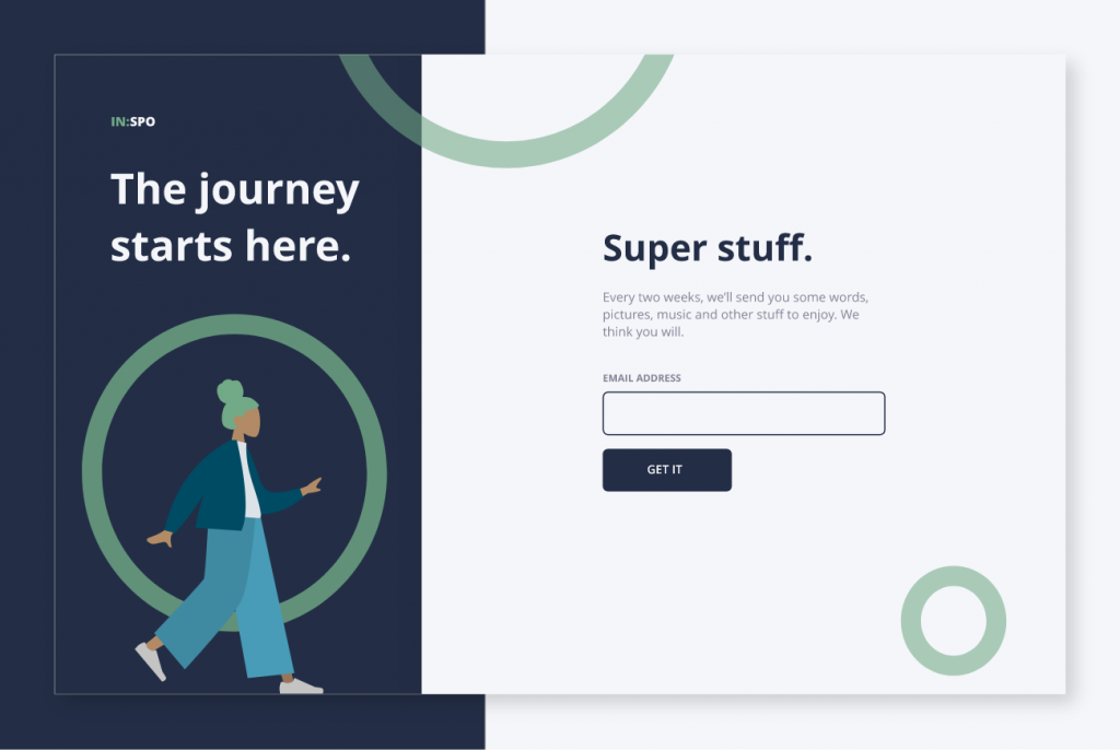
Below is an example of a sign up page. It consists of different brand elements, like logotype, illustration and colors. Together with UI elements such as input field and button they constitute your digital design.
Previous chapters
- Chapter 1: Logotypes
- Chapter 2: Typography
- Chapter 3: Colors
- Chapter 4: Imagery
- Chapter 5: Complementary design element
- Chapter 6: Pictograms
Stay tuned for upcoming chapters:
- Chapter 8: Print Design
- Chapter 9: Video guidelines
- Chapter 10: Interior design
- Chapter 11: Brand strategies