Best practices: How to write company brand guidelines – Print Design
In this series of Best practices: How to write company brand guidelines, deBroome will be sharing our expert knowledge of style guidelines – how to get started, what to include and questions to consider. We hope to give you the tools to create a solid foundation for your brand style guidelines.
Chapter 8: Print Design
In this chapter, we will have a closer look at what needs to be considered when working with print design. We’ll discuss how grids give you a system for layout, how brand elements can be incorporated, color spaces, paper options, and more.
Formats
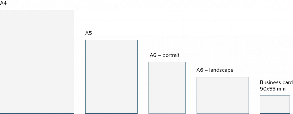
Consider the formats you need to include in your print design guidelines. A-formats, such as A4, A5, and so on, can be a good starting point. But don’t forget to assess which other formats are needed in your organization. Will you be printing posters or information signs for the office? Does your organization plan to provide the employees with business cards? Audit the business needs associated with print formats before getting started.
Grid
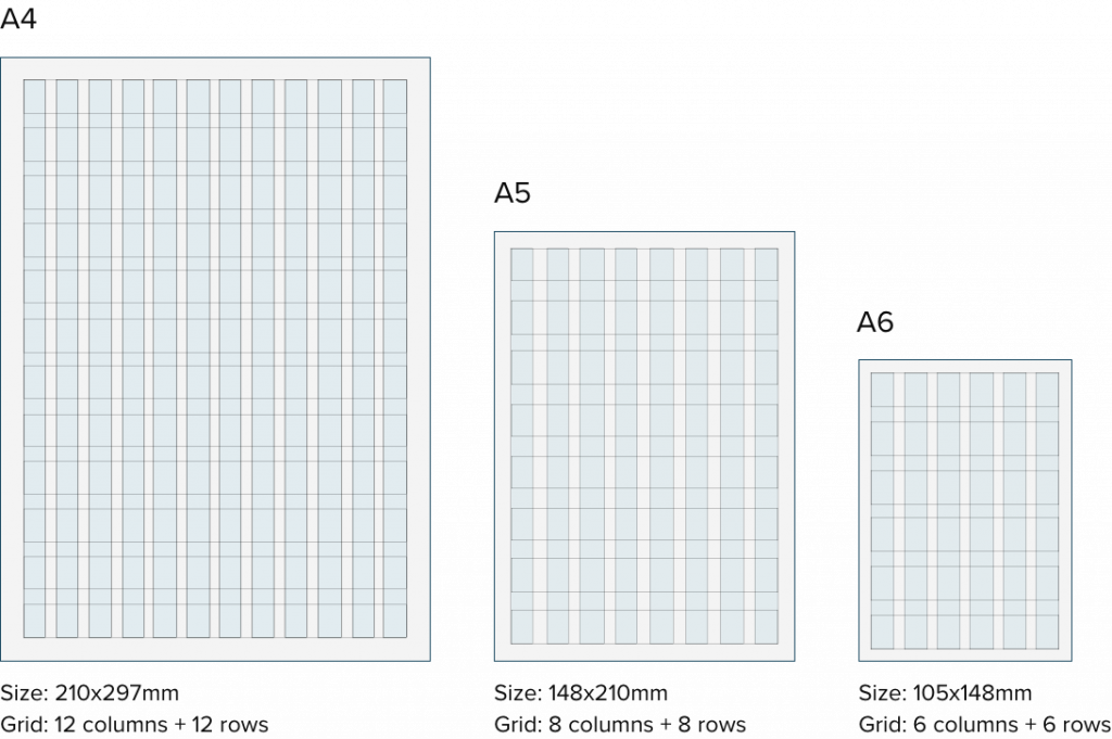
Most print guidelines are rooted in a grid system. The grid helps you to work consistently with your layout, allowing for beautiful, consistent print designs – whether it be stationary, posters or marketing materials.
Here is an example of a grid system for print formats:
Print design elements
As with the grid system, it is important to define and provide guidelines for how your brand elements should be used on prints. Below, we will look at some of the most common brand elements in print design.
Logotype
The logotype, your most important brand carrier, should have defined rules in regards to size and placement in your print designs.
Size
Set a size for your logotype when used in different formats.

Position
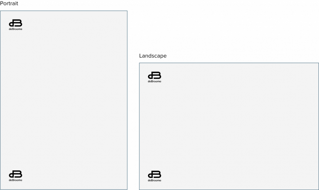
Specify the position your logotype can be placed on in your print designs. The example below shows that the logotype can be placed either in top or bottom left corner for both portrait and landscape prints.
Typography
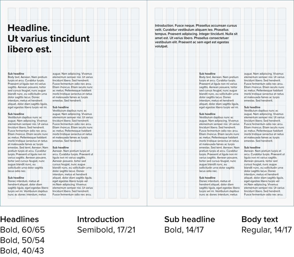
Define the type sizes that can be used in print material but make sure they cater for different needs, from small informative text to large headlines.
Imagery
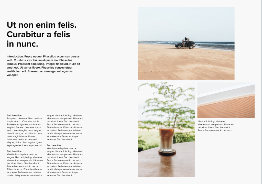
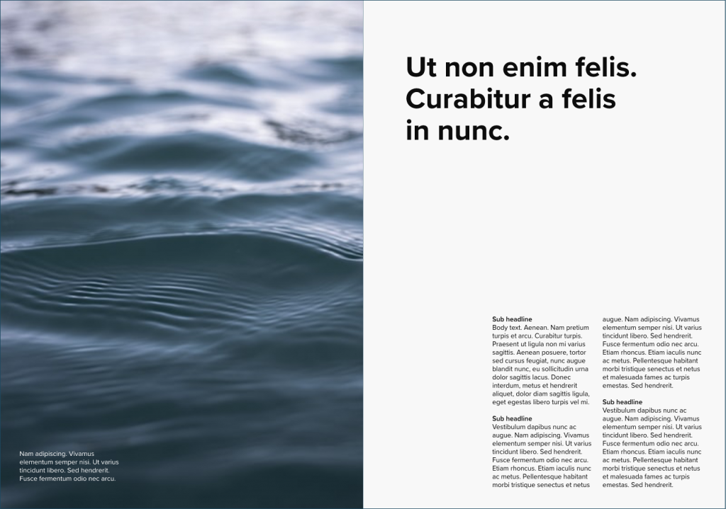
Your brand imagery can be used in a multitude of ways in regards to your print formats. As with the logotype and typography, it is important to define rules for these in order to create consistent, well-balanced prints. Consider bleed vs. margins, symmetry vs. asymmetry, and image sizes/percentages in different formats. Remember to use high resolution photos for better print quality.
Color spaces
CMYK and Pantone are the most common color spaces used for print. CMYK are used for multicolor images, such as photographs, while Pantone are better suited for logo designs and vector graphics.
As CMYK and Pantone are not directly translatable, it is important to use the same color space when printing one specific color.

Paper guide
Your choice of paper should be guided by how the final print will be used. Different papers have different characteristics, affecting image quality and readability, as well as the look & feel of the finished product.
Here are some types and characteristics of paper to consider:
- Coated vs uncoated paper
- Basis weight
- Brightness
- Bulk
- Thickness
- Opacity
Previous chapters
- Chapter 1: Logotypes
- Chapter 2: Typography
- Chapter 3: Colors
- Chapter 4: Imagery
- Chapter 5: Complementary design element
- Chapter 6: Pictograms
- Chapter 7: Digital Design
Stay tuned for upcoming chapters:
- Chapter 9: Video guidelines
- Chapter 10: Interior design
- Chapter 11: Brand strategies
