
Best practices: How to write company brand guidelines – Imagery
In this series of Best practices: How to write company brand guidelines, deBroome will be sharing our expert knowledge of style guidelines – how to get started, what to include and questions to consider. We hope to give you the tools to create a solid foundation for your brand style guidelines.
Chapter 4: Imagery
Through imagery, a brand has the power to express their values and personality. Images evoke emotions that can be difficult to share by just using words.
Mood & Tonality
In images, the mood and tonality are determined by how a company wants clients to experience a brand. Do you want a brand to be perceived as fun or serious, affordable or luxurious, technical or human?
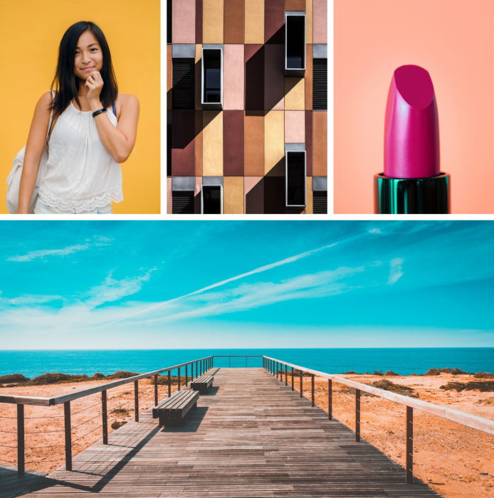
The use of colors influences the effect an image can have on the audience. For example, using vivid colors gives an impression of being fun while toned down colors provide a feeling of being serious. It is useful to include rules of how brand colors are included in images for the style guide.
Styling of employees or other human subjects triggers various signals to an audience. This includes the type of clothing a person is wearing, facial expressions and body language. Ask yourself: should a person portray a casual look with everyday clothing and smiling or a serious look with business attire?
Other creative decisions that can signify the brand identity is if a flash is used or only natural light is allowed. Another aspect to keep in mind is if the shadows are hard or soft and if the depth of field is shallow or deep, e.g. if the backgrounds are blurry or sharp.
Categories
Different categories help to organize images and ease the construction of the guidelines. This makes it easier when giving instructions to photographers or when searching for stock images.
Here are some common imagery categories:
- People
- Still life/Product
- Landscapes
- Architecture
Showing examples of the chosen categories are a great aid on how to apply the guidelines.
Treatment
It’s recommended to also include guidelines on how to select an image.
Final size and viewing distance
The final size and viewing distance are two important aspects to keep in mind when choosing an image. When images are used in small formats, like in a mobile application, or being viewed from a long distance like on a billboard, then the motifs should be clear and not too detailed.
Cropping guidelines
A company should set clear guidelines on how much freedom a person has with cropping images. This includes how much space should surround the focal point as well as the positioning of the focal point.
Copy
When applying copy to an image, it is important to outline where and how much copy to add. Copy is usually not applied directly on top of the focal point like a person’s face.
There also needs to be a contrast between the copy and background image so that the copy is legible and consistent. Perhaps, a certain text color is used for a light background while another color is only applied to dark backgrounds.
Do's & Don’ts
The Do's & Don’ts section can have the most effect in guiding others on how to apply the guidelines. This section includes examples of cropping, combining images, applying filters, and layering copy.
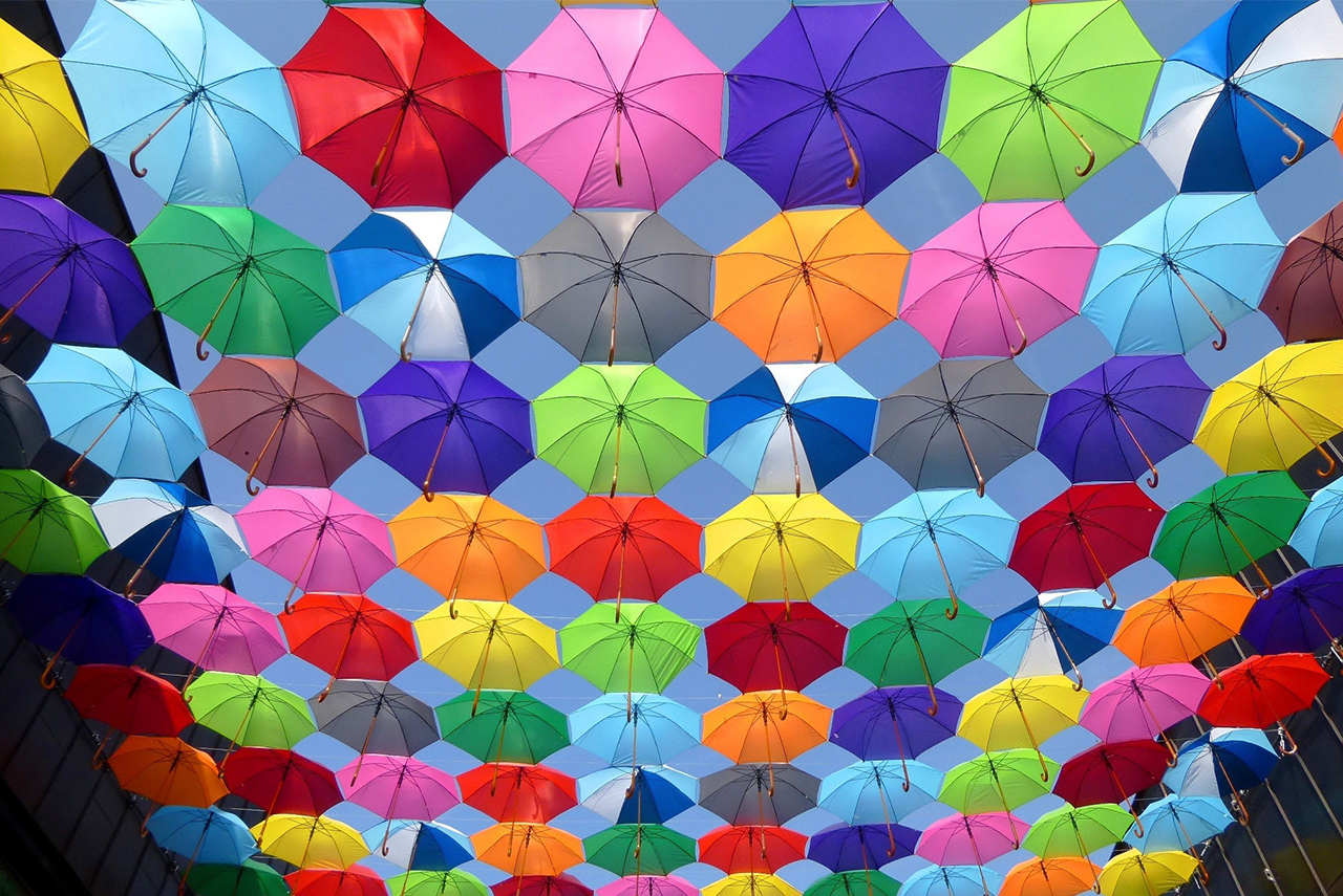
Use vivid colors.

Never use black and white.
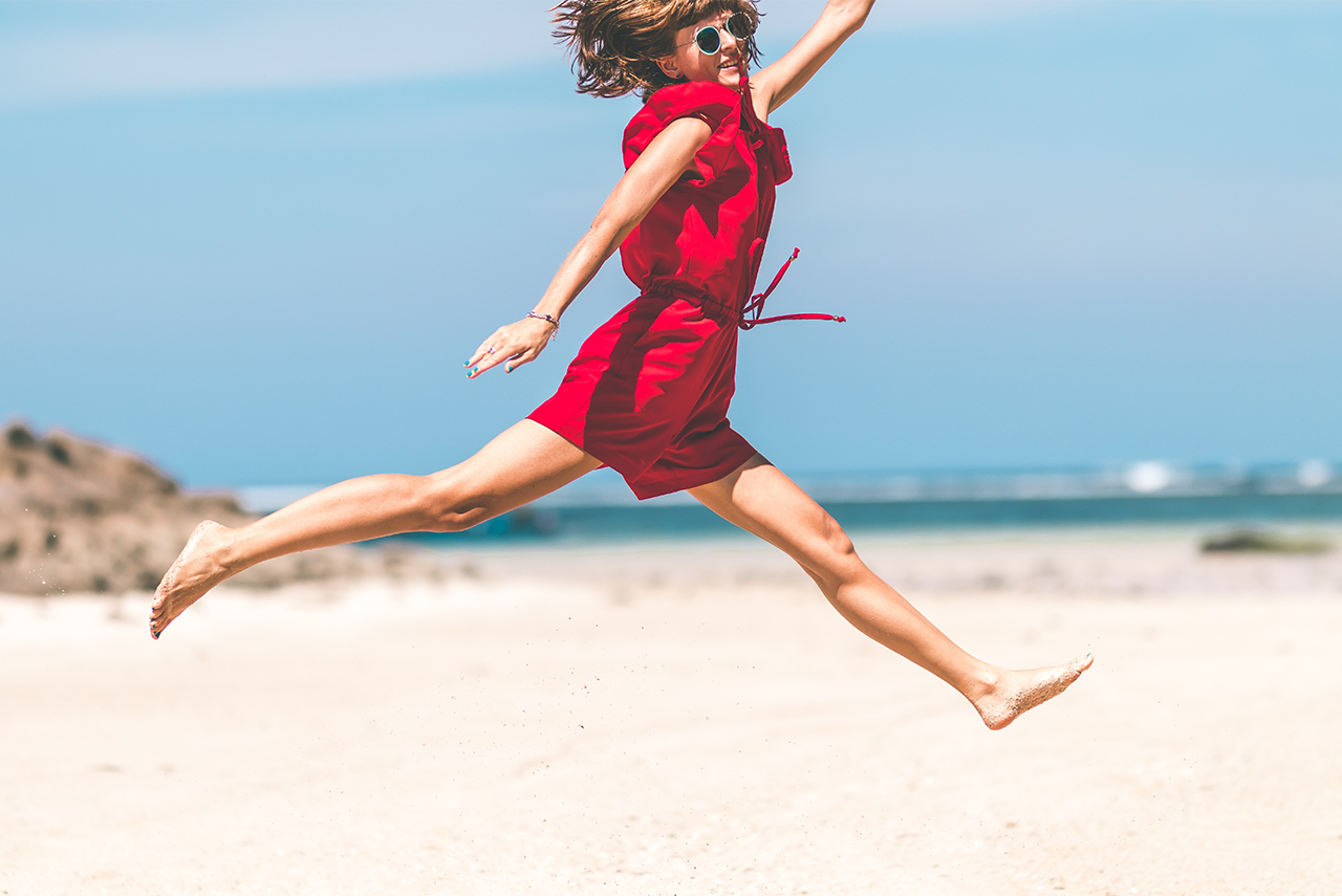
Sunny and happy
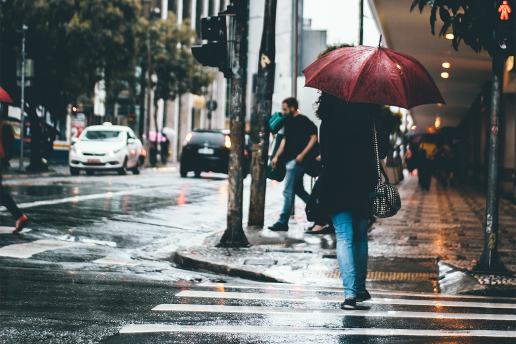
Rainy and dull

Close

Distant