Blogpost Thumbnail

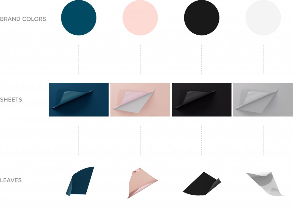
Best practices: How to write company brand guidelines – Complementary design element

In this series of Best practices: How to write company brand guidelines, deBroome will be sharing our expert knowledge of style guidelines – how to get started, what to include and questions to consider. We hope to give you the tools to create a solid foundation for your brand style guidelines.

Chapter 5: Complementary design element

A complementary design element is a visual extension of the brand, often derived from an existing brand element, idea or concept. It can be both static and moving, allowing for an array of ways in which it can be used to enhance branding while communicating the brand platform.

Concept

The complementary design element should be conceptualized to fit something that is (or should be) strongly associated with the brand. It could be inspired by an existing part of the brand's graphic elements. 

Or – as you will see in deBroome’s examples below – it can be based on an idea. In this case, it is the concept of seamless order – here visualized by the (dare we say) satisfying feeling of seeing the fold land in its place, removing the edge.

Library

The library should include all versions and elements of the complementary design element. The chart below shows an overview of the available colors and types.

Sheets
Full-page view can be used as videos, loops and background images. Press play below to see a reel of deBroome's complementary design element. 

Play Video

Leaves
Leaves are considered a set of isolated elements that can be used when sharing space with other visuals such as text in documents or presentations. In the video below, you can see how we use the complementary design element in presentations. 

Play Video

Usage

Since the complementary design element can be used in many different ways, it is important to have clear guidelines on how it's best used to communicate the brand.

Cropping

Whether used for video or as an image, the concept should always be clear for the viewer.

Make sure that the cropping isn't too zoomed in or out in such a way that the concept is not obvious.

Colors

The use of colors and shadows should be defined and available when working with isolated elements. In this case, the leaf and the background go tone-in-tone and a leaf shadow is always included.

It is recommended that colors are not randomly mixed unless other information is communicated. Specify if transparency or lighter tones are applicable. 

Text

It is important to define how text is used together with the complementary design element. In the examples above, white or black text with appropriate contrast is used with either a central or left alignment. 

On the other hand, using colors other than black and white or aligning the text to the right is not allowed. 

Examples

Special thanks to Crosby for an excellent job of creating deBroome's complementary design element!

Previous chapters

Stay tuned for upcoming chapters:

Follow the Best practice series and sign up for our newsletter.

Tell your friends!

Dino Ceric

Dino Ceric is a product designer at deBroome, revolutionizing the way businesses manage their brand through digital brand products.

Related posts