
Best practices: How to write company brand guidelines – Colors
In this series of Best practices: How to write company brand guidelines, deBroome will be sharing our expert knowledge of style guidelines – how to get started, what to include and questions to consider. We hope to give you the tools to create a solid foundation for your brand style guidelines.
Chapter 3: Brand colors
Color speaks volumes about a brand. Being an expression of the brand identity, colors influences consumers. As color attracts consumers, they evoke emotions – feelings of warmth, security, excitement, curiosity or home. Emotions drive decisions and in reference to brands, that equals profits. When a brand repeatedly markets with the same color, it strengthens their brand awareness. Consistent use of color provides a common link between departments, sub-brands and products. Therefore, it is essential to choose a brand’s colors carefully and communicate the guidelines clearly,
Color palette guidelines
Before we dive into the specifications of color, it is important to define a color palette or a palette. A color palette is the full range of colors that a brand sets as their identity. This combines all the colors mentioned below into one palette.
A color palette provides depth to brand. Within a brand guidelines, the purpose and the use of the colors should be described. Moreover a color palette should explain how the colors reflect the brand’s personality and what kind of consumers they want to attract.
Primary color
Primary colors help consumers to quickly identify a brand. These are the core colors of the brand. Commonly, primary colors are incorporated into a company’s logo. A company has between 1-3 primary colors but there can be more if desired.
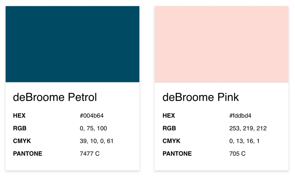
deBroome primary colors
Secondary color
Secondary colors highlight and compliment the primary color or colors. They usually have a range of 1-6 colors. Companies can decide to have an infinity of secondary colors but we suggest to limit the color palette as it helps with recognition and consistency.
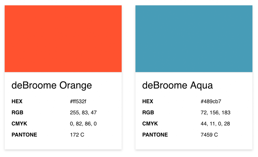
deBroome secondary colors
Tertiary color
A tertiary color is a third level of a color palette that combines primary and secondary colors. A favorable reference point for the use of these colors is 10% of the entire color palette. Even though tertiary colors are not used often, they are still useful in adding diversity to the palette. Charts and graphs are good examples of usage of both secondary and tertiary colors.
Black and white
Black and white can be easily overlooked in brand guidelines but it is worth noting these colors. Generally, black is primarily used as a text and background color while white provides contrast and clear spacing.
In some cases like print, companies may want a rich black and use all four print colors, for example: cyan 40%, magenta 30%, yellow 30% and black 100%..
For digital use, pure black (#000000) is not recommended for backgrounds or text. Pure black overpowers surrounding objects and is straining on the eye on digital devices. Ultimately, pure black is not user-friendly and should be avoided.
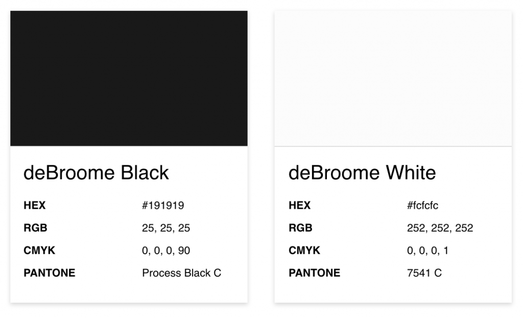
deBroome black and white
Grayscale
A grayscale shows a variety of different shades of gray. The highest level of gray is black and the lightest shade is white. Having a grayscale, can help support primary colors.
Color combinations
Combining colors is no easy task. That is why clearly stating how to work with multiple colors is fundamental in a company’s brand guidelines.
- Monochrome: uses different tints, tones and shades of the primary color
- Accent color: a secondary color that best compliments the primary color
Monochrome
When creating a monochromatic palette from tints, tones and shades, it enables versatility and cohesiveness. Furthermore, it stays true to the brand’s color while providing flexibility.
- Tints: uses white to lighten the color
- Tones: uses gray to dull the color
- Shades: uses black to darken the color
Accent color
A secondary color can be featured with a primary color as an accent color. The primary color is still the dominant color but the secondary color is used in combination to draw attention.
Color proportions
A color proportion scale is a great way to demonstrate how much the colors should be used. This can be displayed in a circular diagram, rectangular layout, chart or in abstract shapes. The primary color is the largest color with the secondary color being a medium size and the tertiary color in the smallest form.
Here is the rule of thumb for showing color proportions:
- 3 colors: primary color ½; 2 secondary colors ¼ = 50:25:25
- 4 colors: 2 primary colors ⅓; secondary color ⅙; tertiary color 1/12 = 33:33:16:8

deBroome colors in a circular diagram
Brand color formats
Colors are communicated in all different types of formats depending on its purpose. Below are the most common color formats.
- HEX: hexadecimal
- RGB: Red, Green, Blue
- CMYK: Cyan Magenta Yellow Key. Key is another term for black.
- PMS: Pantone Matching System
- NCS: Natural Color System
- RAL: Imperial Commission for Delivery Terms and Quality Assurance (Translated from German: Reichs-Ausschuß für Lieferbedingungen und Gütesicherung )
HEX
HEX code is the key to unlock web and digital design like HTML, CSS and SCSS. Colors are represented in a 6 number and/or letters combination. For example, black is #000000 and white is #ffffff.
RGB
RGB is also for digital use including television. For this format, RGB combines red, green and blue to create a spectrum of colors. For this format, black is 0,0,0 and white is 256,256,256.
CMYK
For print use, CMYK is ideal. Tiny dots of cyan, magenta, yellow and black are overlapped to blend colors. Because of limitations with a printer, not all colors can be produced.
Black is represented as 0,0,0,100 and white is 0,0,0,0. For an even richer black, cyan and magenta can be added to 100% black, resulting in 50,50,0,100.
PMS
Recognizably referred as Pantone or Spot Colors, PMS is used for print and textile production. There are variations of Pantone depending on whether the paper is glossy or coated (Pantone C) and uncoated (Pantone U).
In standard Pantone, black is “PANTONE Black C”. A pure white is nonexistent as the creator assumes the image is printed on white paper.
NCS
Based on how the eye perceives color, NCS is used for paint. Since black is unnatural to the eye, there is not a pure black or white. However, a dark black is S 9000-N and light white is S 0300-N.
RAL
RAL is the standard color for tangible products used for varnish, powder coating and plastics in the trade, architecture and design industry. Jet black is RAL 9005 and pure white is RAL 9010.
Color swatches
Swatches are a predefined collection of colors that are easily accessible in media editing tools. In this case, it is a color palette file that includes all primary, secondary and other brand colors.
In particular, an Adobe Swatch Exchange file (.ase) is supported by InDesign, Illustrator and Photoshop. Within Adobe Photoshop, a Adobe Color (.aco) file can be created to collect different colors in HEX, RGB and CMYK color codes.
Do's & Don’ts
Examples of how to and how not to use colors are shown in the Do's & Don’ts section of the brand guidelines. This includes how to use colors against backgrounds, in combination of each other and text use.
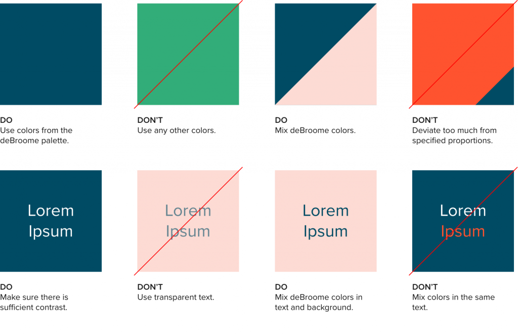
deBroome Do & Don't guidelines
Previous chapters
- Chapter 1: Logotypes
- Chapter 2: Typography
Stay tuned for upcoming chapters:
- Chapter 4: Imagery
- Chapter 5: Complementary design element
- Chapter 6: Pictograms
- Chapter 7: Digital Design
- Chapter 8: Print Design
- Chapter 9: Video guidelines
- Chapter 10: Interior design
- Chapter 11: Brand strategies