Best practices: How to write company brand guidelines – Video guidelines
In this series of Best practices: How to write company brand guidelines, deBroome will be sharing our expert knowledge of style guidelines – how to get started, what to include and questions to consider. We hope to give you the tools to create a solid foundation for your brand style guidelines.
Chapter 9: Video Guidelines
Video content is consumed more than ever before – and it is rapidly increasing. It is a communication method that can bring your brand, product or service to life. It can be used for all kinds of purposes – from advertising to recruiting and presentation support. In this chapter, we will provide some insight and tips on how to work with your video guidelines to achieve consistency and clarity.
Getting started
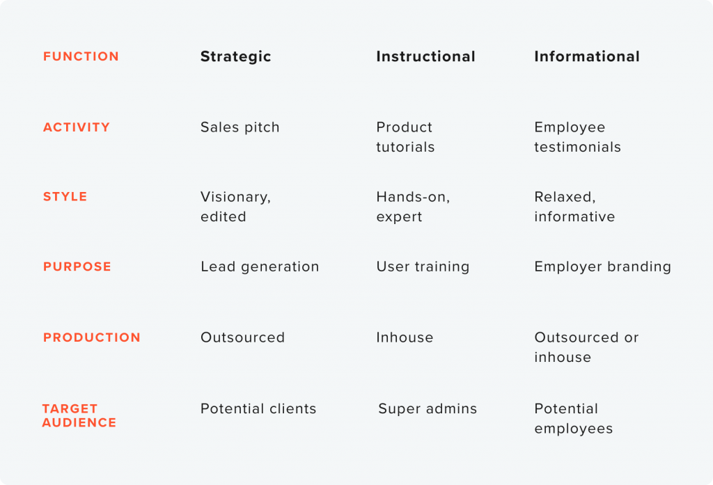
One of the first things you should do is to define your video types. What kind of video content will you be creating, for which purposes and to which target audience? See this exercise as a way of taking a high-level approach to all your video productions. It will help you in all kinds of decisions going forward, style, frequency, production … you name it.
See the example below. We begin with identifying the different functions – for example strategic, instructional and informational. We can already start filling these functions with different areas of use.

Once we have identified our functions, we can go more in-depth and define all kinds of specifications.

Applying your branding
Above, we have touched on purpose, tonality and target audience. In this section, we will have a look at things to consider when applying your branding to videos.
Grid and safe margin
A grid will help you set a layout for your videos so that any elements applied on top will look consistent across different videos. Also consider to use a safe margin, since the videos might be viewed on different platforms and devices.
Logotype
Will your logotype be in the videos? If the answer is yes, make a dedicated space to place it and make sure it is within the safe margins. Do you have an animated logotype? Here is a great opportunity to make use of it.
Typography
Sometimes, our primary fonts might work great in print, but not so well in videos. If this is the case, define a fallback font to be used for video production that does not sacrifice the readability. The most important thing is that your message comes across.
Tone of voice
Are you formal, corporate, humorous? A defined tone of voice will give you a solid platform to stand on when producing videos for different purposes and audiences.
Look, feel and sound
Your general brand elements and guidelines work together to allow you to stay on-brand when producing videos. The more defined they are, the easier it will be to produce video specific guidelines. The look and feel might be derived from your image style and the sound from your tone of voice guidelines.
Make available
Finally, and this is really important, do not reinvent the wheel. Video content production used to be really expensive, available only to large companies with generous marketing budgets. Today, we can use everything from smart phones to online tools and with ready-made functionality to produce videos.
Do you have existing elements that can be re-used? A bumper or animated logo perhaps? Make sure to document how they should be used and make them available for those who need it.
Examples
Below are a few examples of corporate videos. Based on what you have learned in this chapter, can you spot some patterns that could be defined in a video guideline? Consider things such as the purpose, tonality and use of graphic elements and text.
Previous chapters
- Chapter 1: Logotypes
- Chapter 2: Typography
- Chapter 3: Colors
- Chapter 4: Imagery
- Chapter 5: Complementary design element
- Chapter 6: Pictograms
- Chapter 7: Digital Design
- Chapter 8: Print Design
Stay tuned for upcoming chapters:
- Chapter 10: Interior design
- Chapter 11: Brand strategies
