In this series of Best practices: How to write company brand guidelines, deBroome will be sharing our expert knowledge of style guidelines – how to get started, what to include and questions to consider. We hope to give you the tools to create a solid foundation for your brand style guidelines.
Chapter 6: Pictograms
Pictograms are a great way to express meaningful messages in a picture form. Most businesses create their own collection of pictograms to stay consistent with their brand identity.
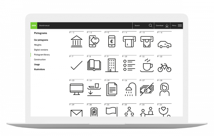
Pictogram library
The pictogram library is the central location for all the pictograms. A quick glance at the pictogram library can give you an overall feel for the brand identity, aspects of company offices and product features.

SEB pictogram library, visit here
Usage
Pictograms are for both print and online use. They are included in presentations, reports, or surveys to compare, show ratings or display percentages. Moreover, pictograms can indicate the progress of a goal by showing key stages.
Unlike images, pictograms usually have clear self-explanatory meaning. However, in some cases, pictograms may need supporting text.

Example of a pictogram illustration
Do's & Don’ts
It is important to clearly outline what is allowed and not allowed when using pictograms.


