Best practices: How to write company brand guidelines – Logotypes
In this series of Best practices: How to write company brand guidelines for logotypes, deBroome will be sharing our expert knowledge of style guidelines – how to get started, what to include and questions to consider. We hope to give you the tools to create a solid foundation for your brand style guide.
Chapter 1: Logo guidelines
A logotype (logo) is a company’s most effective iconic image. It is a brand asset that provides recognition and influence our decisions. Logotypes communicate what values a company intends to represent. They have the power to differentiate from competitors, instill brand trust and ultimately, increase profits. That is why it is so important to include it in your brand guide, to get it right and not have inconsistencies.
Types of logotypes
Variations of logotypes allow flexibility to serve different purposes such as print or digital use. They highlight a company’s personality – for example entertaining or sincerity. Logotype variations can even help identify a brand in different settings like a company’s website versus partner’s website.
- Primary: identifies the brand and is most commonly used
- Secondary: retains the original character of the primary logo but can be used for different functions or usages
- Animated: adds another dimension to the logo, allowing it to stand out in a digital landscape
Primary logo
The heart of the brand lies in the primary logo. A primary logo is the foundation for a brand’s visual identity usually consisting of the brand colors and typography. In general, it is a strategic brand tool with the most power to be recognizable for the public.

deBroome's primary logotype in black and white
Secondary logo
In some cases, a primary logo is not compatible with all online platforms. A secondary logo adds flexibility and enhances a brand’s personality. Secondary logos can be used to fit a specific background or purpose.

deBroome's secondary logotype
Symbol
In instances where the traditional logo with text can not be used, a company could use simply the symbol with the same color palette.
Animated logo
Today, it is more common that consumers come into contact with a company's logo on digital devices than in traditional spaces. Animating the logo provides an opportunity to stand out and catch consumer's attention to get a message across in a unique way.
Animated logos are used on websites, in social media, videos and any other digital space. Read more about animated logos. Logotype animation example
Logo placement
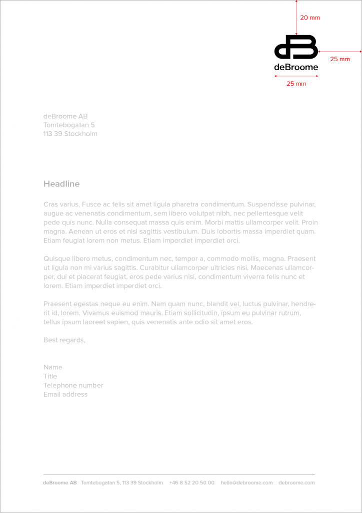
Setting clear logo placement guidelines help establish a corporation as recognizable, trustworthy and aesthetically appealing. Brand guidelines for placement are essential for preventing inconsistencies and any misunderstandings. Logo placement includes letterheads, invitations, brochures, advertisements, products, promotional items, websites, videos, email signatures, or any other logo positioning.

deBroome logotype in letterhead
Clear space
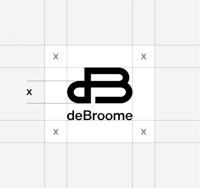
Standards should be set to distinguish the space around the logo which is referred to as clear space. This helps ensure the distance from other design elements that surround the logo. Ultimately, clear space increases the visibility and impression on the audience.

deBroome defines "x" and uses it to determine the clear space
Logo size
Companies should consider establishing brand guidelines for logo sizes. This prevents any image or font you use within a logo from being unreadable when being minimized.
Having different logo sizes on hand helps with easy distribution for advertising purposes that require specific dimensions.
Here are some references that you may find helpful for dimension sizes on social media.
- Facebook Business page
- Instagram resolution
- Twitter image and GIF restrictions
- Linkedin image specifications
- Google+ background images
Format
Companies may want to specify the image format of their logo so that image quality is consistent.
It is recommended to use vector files (.svg, .eps, .ai) as they provide high resolution and resulting in sharp images. Moreover, vector files can easily be edited by designers if needed.
Here are some recommendation of types of files that should be used for specific formats.
- Animated logos: .svg or .png format
- Original files: .ai or .eps
- Digital usage as in a PowerPoint or Keynote: .png (which allows transparency) or .jpg
- Print: .ai, .eps or .tif
Co-branding
When companies work with other organizations, it may be a struggle to know how brands should share the limelight. That is why partnerships should outline a set of rules of how they work together and how co-branding is promoted. This includes guidelines of how the brands are placed together in brochures, invitations, presentations, social media ads, and any other collective location.

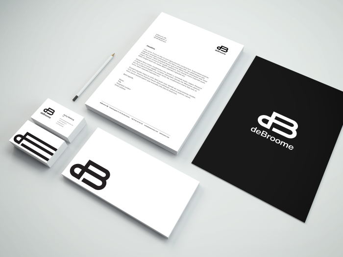
Example of deBroome documents
Do's and dont's for logotypes
Perhaps, the most visually helpful tool when creating logo usage guidelines is Do's and Don’ts. Clearly, show examples of logo placement, editing and use where a logo works and doesn’t work. This includes margin placement, logo rotation, placement on backgrounds and color alterations.

No shadowing, no tilting, no overlays, ensure visibility against backgrounds
Stay tuned for upcoming chapters:
- Chapter 2: Typography
- Chapter 3: Colors
- Chapter 4: Imagery
- Chapter 5: Complementary design element
- Chapter 6: Pictograms
- Chapter 7: Digital Design
- Chapter 8: Print Design
- Chapter 9: Video guidelines
- Chapter 10: Interior design
- Chapter 11: Brand strategies
Follow the Best practice series and sign up for our newsletter.
Want to know more on presenting your guidelines in Brand Portal?
Book a demo, we'd be happy to have a chat.
