Designing your visual identity – and how to make it last over time
The visual identity communicates a brand’s personality to the public – what it stands for, its ambitions and its traits. It is therefore of the essence that a brand’s visual identity reflects the core values and the heart of the brand.
We sat down with Jonas Björkman, one of the owners and partners of the design agency DOT Stockholm, to get a deeper understanding of the creative process behind creating a visual identity, what to consider, how they created deBroome’s logotype and their experience of using a digital brand portal to deliver assets and guidelines.
Tell us about DOT Stockholm.
DOT Stockholm is a design agency located in Sweden, specialising in graphic design. Visual identities, signage and exhibition design are some of the services that we provide. Our customer base is wide, and we see it as a privilege to get to work with clients from different countries and industries.

Describe your creative process when creating a visual identity.
Our design development is always a step-by-step process.
The starting point is a description of the assignment, or brief, followed by our own research. It is important to get to know the brand’s environment and market, which is an ongoing discussion with the client. Our end result should align with the clients identified needs and exceed expectations.
For us, it is important that our designs are sustainable and have the ability to last a long time. Our name, DOT – Design Over Time, is our main guideline.
"Our name, DOT – Design Over Time, is our main guideline."
What do you have to consider in order to get a successful visual identity?
Be prepared, it is essential to have done your home work. Consider what purpose the visual identity serves and what goals it should fulfil. You have to put in the time and effort necessary for the vision to become reality.
It is also important to know that a successful visual identity requires continuous monitoring and improvements. Once the different graphic elements are set you have to think about implementation and later follow-ups. Our job is to provide a toolbox to our clients that makes it easy for them to stay competitive and look good.
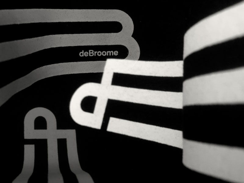
What did you take into account when making deBroome’s logotype?
First of all, it needed to reflect the essence of deBroome. And, as always with logotypes, our aim was to make it clear and distinct. It had to cohere with the existing website and the current brand identity. Different versions were made to ensure that it could be used in different sizes and contexts. We also considered that the new logotype had to be easy to animate and work well in the digital environment, as well as in print.
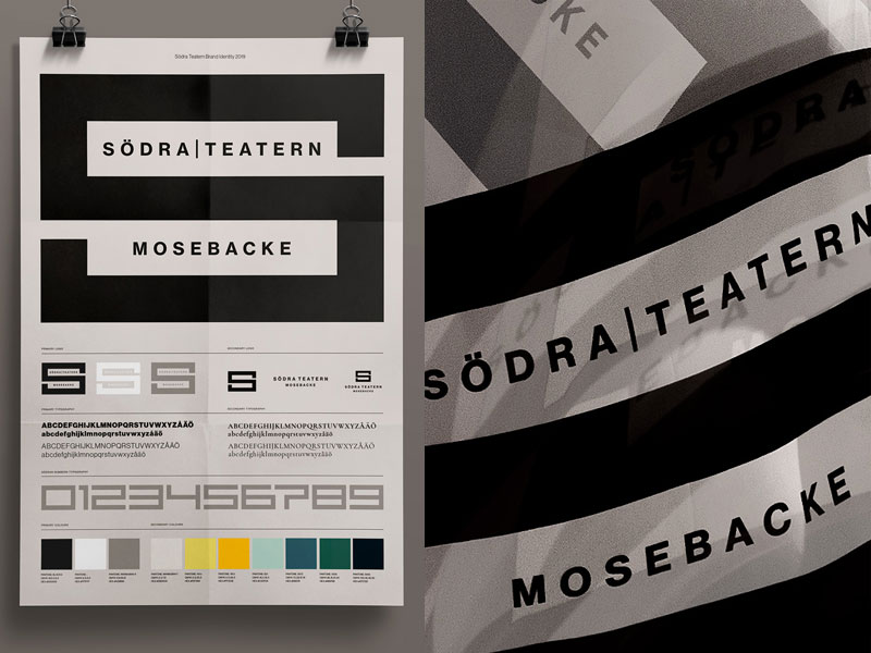
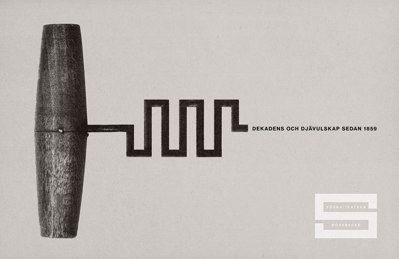
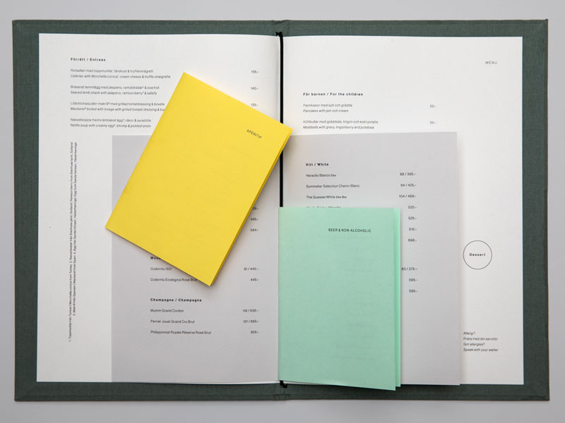
DOT Stockholm created a new visual identity for Södra Teatern, where you also used deBroome’s brand management tool. How does a digital brand portal help in delivering assets and guidelines?
Using a digital brand portal makes it easy to deliver assets and guidelines continuously throughout the project, in an inspirational and straightforward manner. It is also simple for our client to share the graphic guidelines to external suppliers and partners.
It saves time and makes the workflow more efficient. Having all graphical elements gathered in one central location makes them accessible and pave the way for everyone to use them consistently.
