The Tiger of Sweden’s trademark is on a new prowl
Since 1903, Tiger of Sweden has established itself as one of Sweden’s leading fashion brands – designing for royalty, Academy Award winners, and fashion enthusiasts. Now, they have elevated their iconic brand by reinventing their logotype – the staple of Tiger of Sweden, the roaring tiger. Taking on this project was an Antwerp and London based design agency, A New Archive and Tiger of Sweden’s Creative Director, Christoffer Lundman.
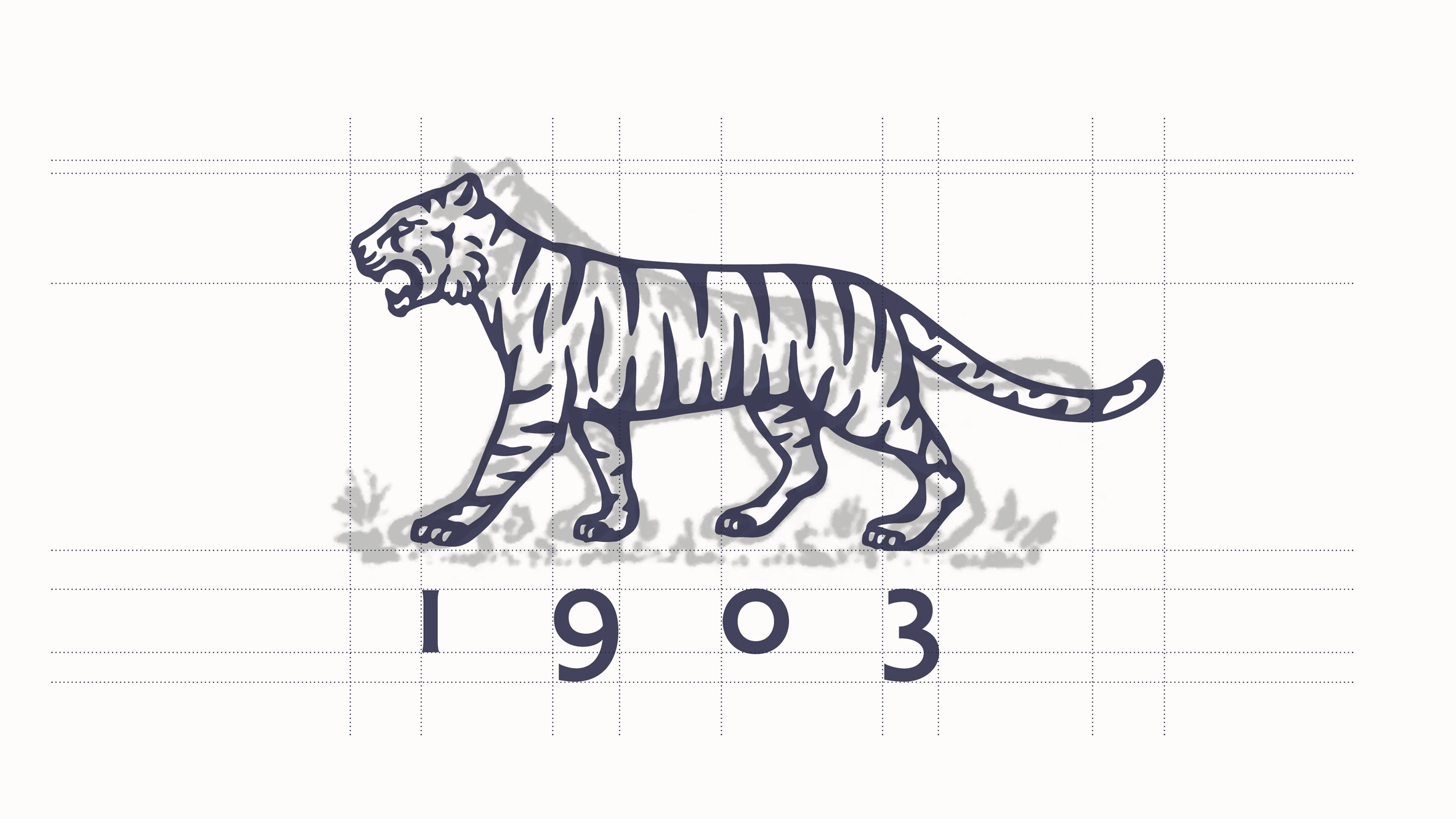
Replacing the black and white tiger face, Lundman and A New Archive went back to Tiger of Sweden’s roots by redesigning a former suit label used in 1926. This was a rich discovery, recreating a roaring, charismatic tiger.
Former logo |
1920s logo (Image from Creative Review) |
Not only has the symbol changed, but also the color scheme and typeface. Inspired by Sweden’s ancestry, Tiger of Sweden chose a dark blue and off-white as well as dark yellow for a secondary color. Their new typeface, Adobe Garamond Pro, is a clean but also playful style.
The new logo, hands down, allows more flexibility and appeal. The logotype has various versions by combining brand name, date, and/or tiger. This new logo is certainly designed for the future.
Most importantly, Tiger of Sweden's logo tells a story of its heritage. It ignites what Sweden is renowned for – creativity, democracy, and entrepreneurship. Thus, the new logo blends together the brands’ values.

New logo
In a statement made by Tiger of Sweden, “the new visual identity is about defining that new mood, which is inspired by the heritage and a century’s worth of values and outward-looking attitude.”
Tiger of Sweden has held the importance of brand consistency by having a brand portal through deBroome’s services. By simply updating their logos and guidelines on this tool, the reformed guidelines are easily accessible to all their employees and partners. Therefore, the transition to their new identity has been a breeze as soon as the new brand identity was launched.
Top image from Dezeen


