Animated logotypes – Why, how and where to use them
The logotype is your most important brand asset. It is a symbol to build your brand, workplace and community around, providing an anchor point for your identity and brand promise. It is probably also your most used asset – from external marketing activities to internal documentation. Even though a lot has changed in logo design, surprisingly much has stayed the same. Until now.
From the days of the Renaissance, when craftsmen first began to chisel symbols as signs of craftsmanship, onward to the first trademarked logotype in 1876 and beyond, to today's saturated market where we are exposed to hundreds of logotypes a day, one thing is clear: the logotype has not evolved as much as one might think. Yes, we have access to research in colour psychology, endless access to inspiration and advanced tools that allow us to efficiently design and test beautiful work. But so does everyone else.
With this in mind, advocates (mostly creatives wanting to do something new and exciting) argue that the natural next step in the relatively slow evolution of the logotype is to make it move. Come to think about it, they might be right. Below, we have listed some reasons why you should have an animated version of your logo, where you can use it and some inspirational examples.
Why should you use an animated logo?
1. Stand out
Think about the current logotype landscape. Consumers get exposed to hundreds, perhaps thousands, of logotypes a day, leading to low impact and engagement. Animating your logo gives you a chance to stand out and catch the attention of consumers to get your message across.
2. Be innovative
A lot of brands pride themselves in being innovative. Here's a chance to prove it. It has never been cheaper or easier to do something new and exciting with your logotype.
3. It's fun
What do we look like? What do we sound like? What do we feel like? These are all firmly established questions in marketing and brand strategy. Animating the logotype gives a whole new dimension to your brand and forces you to answer a new question: What do we move like? Although it can be a quite demanding task, we guarantee it's a fun and engaging one.
4. Take advantage of digital
Leverage digital to your advantage. Today, it is probably more likely that consumers get in touch with your logo on digital devices than in traditional spaces. Being far into the digital era, we have grown used to adapting to new platforms, technologies and opportunities.
Where you can use it
Social Media
The use of both GIFs and videos has increased exponentially in social media. Take the chance to share and create some buzz around your logotype. Why not create a few animated versions and have your followers vote for their favourite? This engages your audience and helps you choose the right one.
Your website
Put your animated logo in the navigation bar and loop it in once, have it come in to your content or make it interactive – the possibilities on your website are endless.
In videos
An animated logo as intro and/or outro makes your video look more professional and sends a clear message of ownership.
Digital OOH banners
Digital out-of-home banners have become a natural element on our city streets, in bus stops and subway stations.
Screen saver
Make sure to make some extra advertising for your brand every time your laptop goes to sleep.
A few inspiring examples

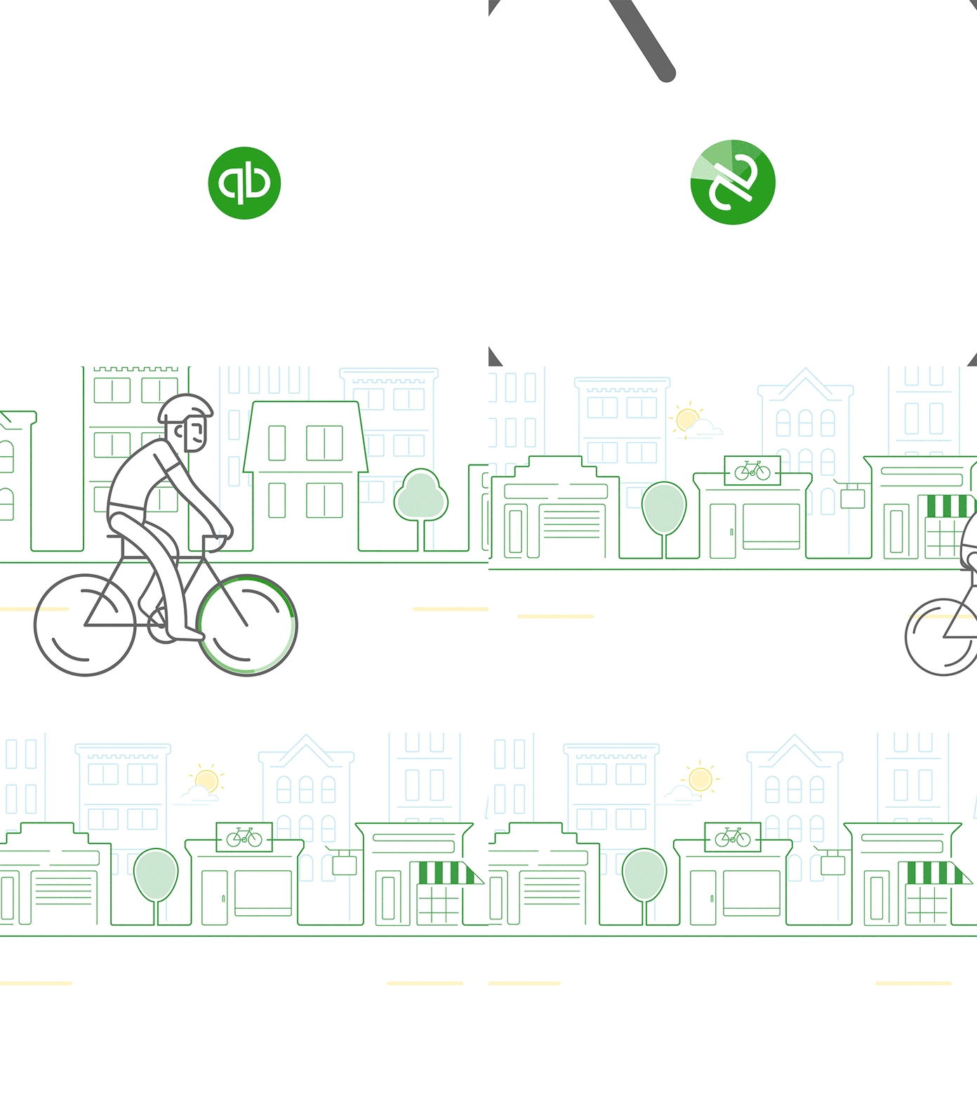
QuickBooks Biker by Brandon Wall

Embla by A friend of mine

Rocketgraph by Tony Pinkevych for Untime Studio
